(Kimberly (she/her) took the express train down the fountain pen/stationery rabbit hole and doesn't want to be rescued. She can be found on Instagram @allthehobbies because there really are many, many hobbies!.)
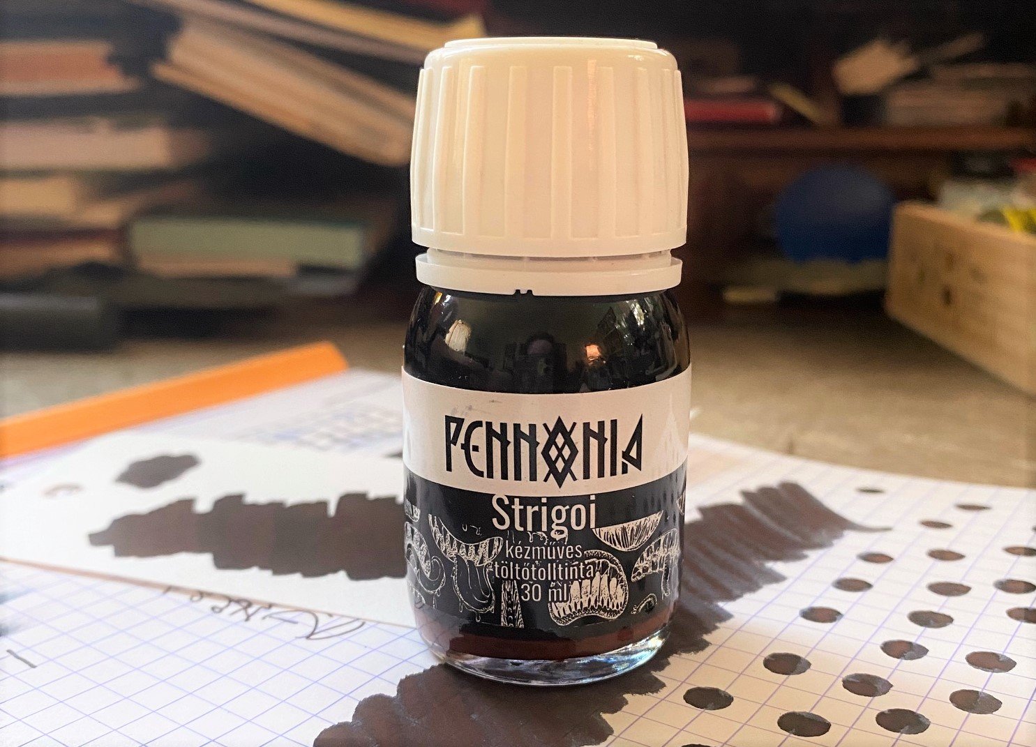
When I went to the St. Louis Pen Show last year, Tori Woods of Stationery Universe gave us some sneak peeks at her upcoming ink collaboration with Pennonia. At the time, she was still deciding between a few color samples, so I wasn’t sure what the end product would look like. Needless to say, I couldn’t wait to find out!
Tori was inspired by the Morpho aurora butterfly to create the Morpho Collection, a set of four inks, in two colors (Morning Morpho & Midnight Morpho), in formulations with and without shimmer.
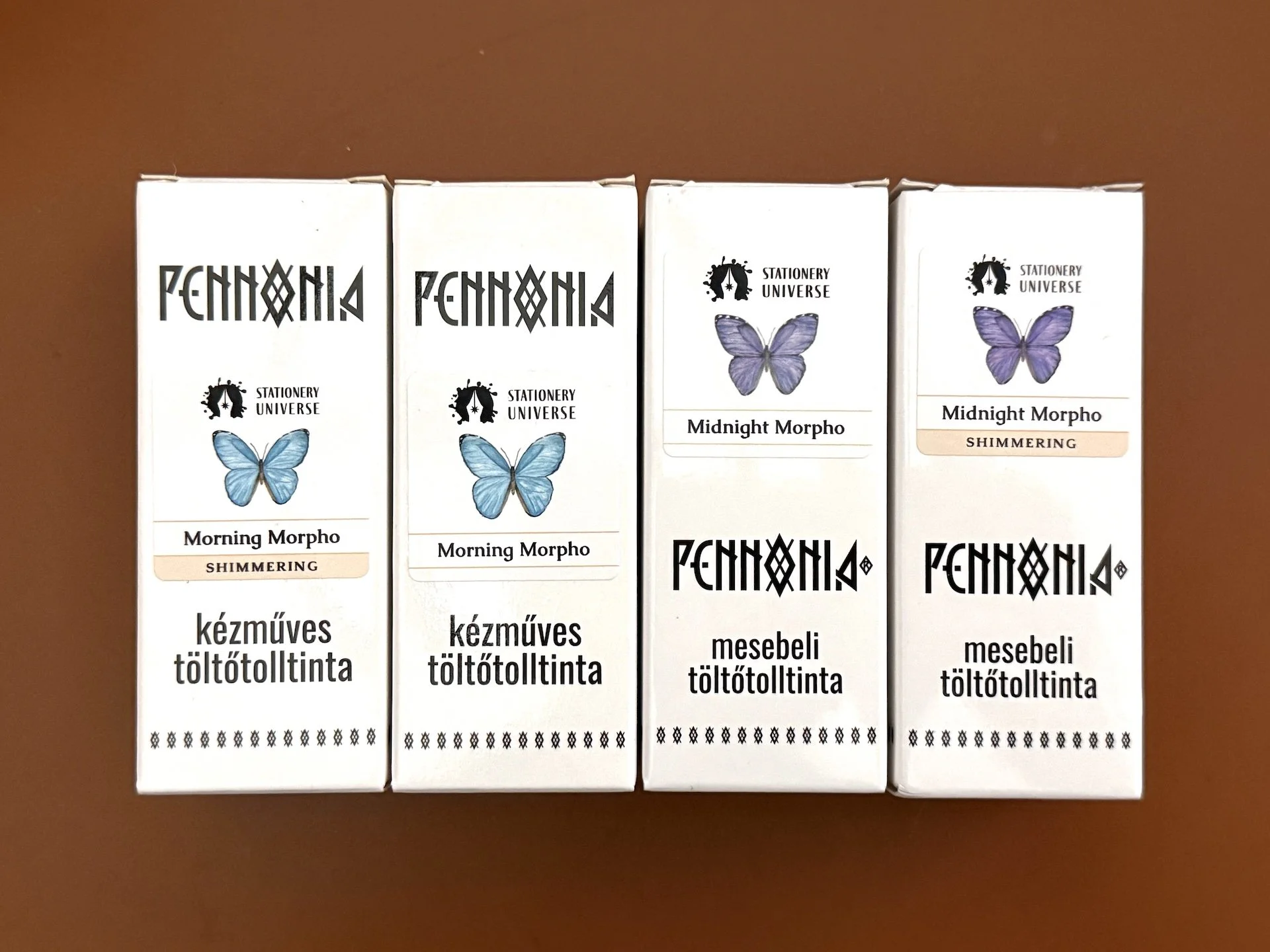
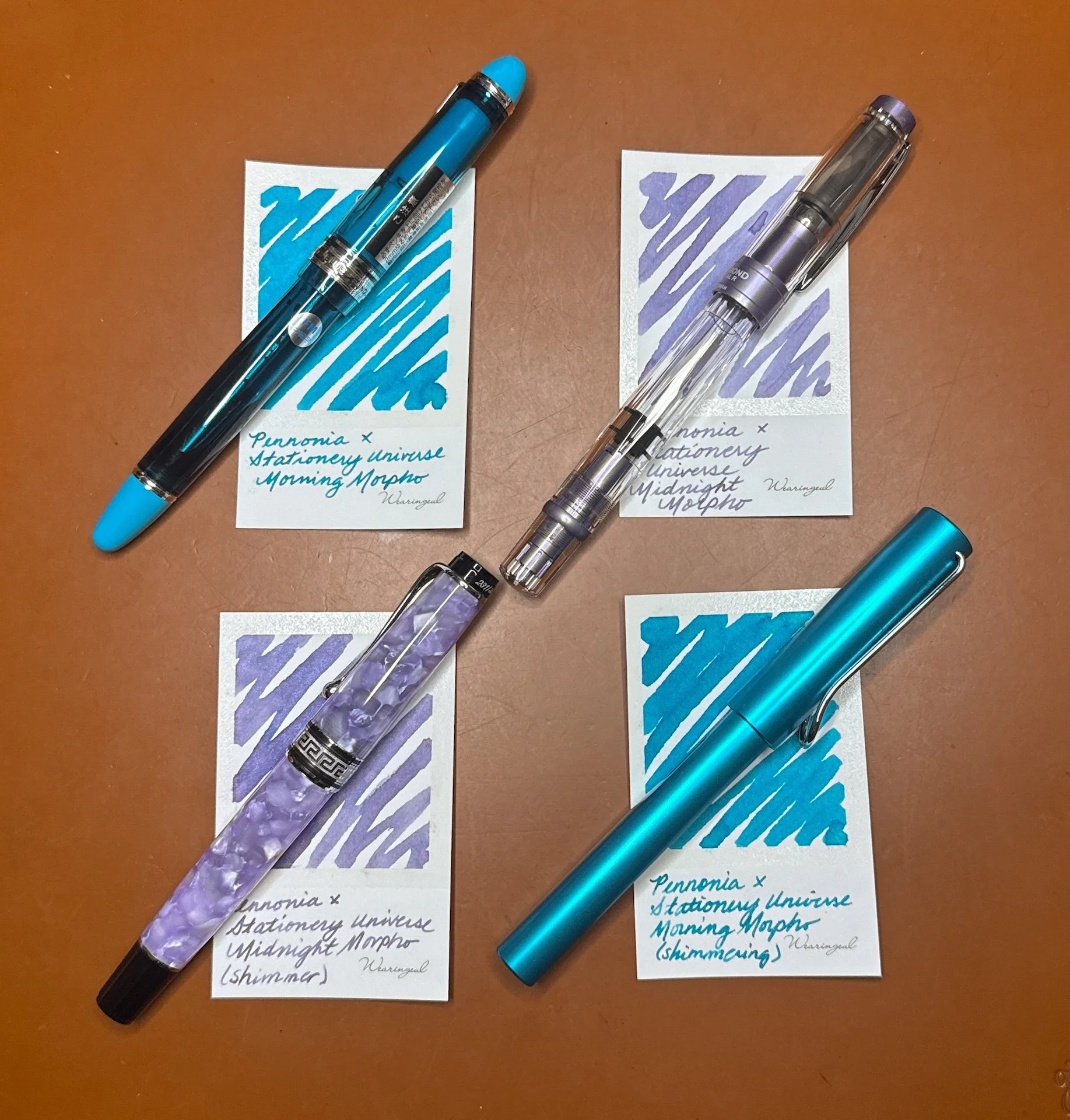
Pennonia x Stationery Universe Morpho Collection, The butterfly labels help you see what colors are in the bottle.
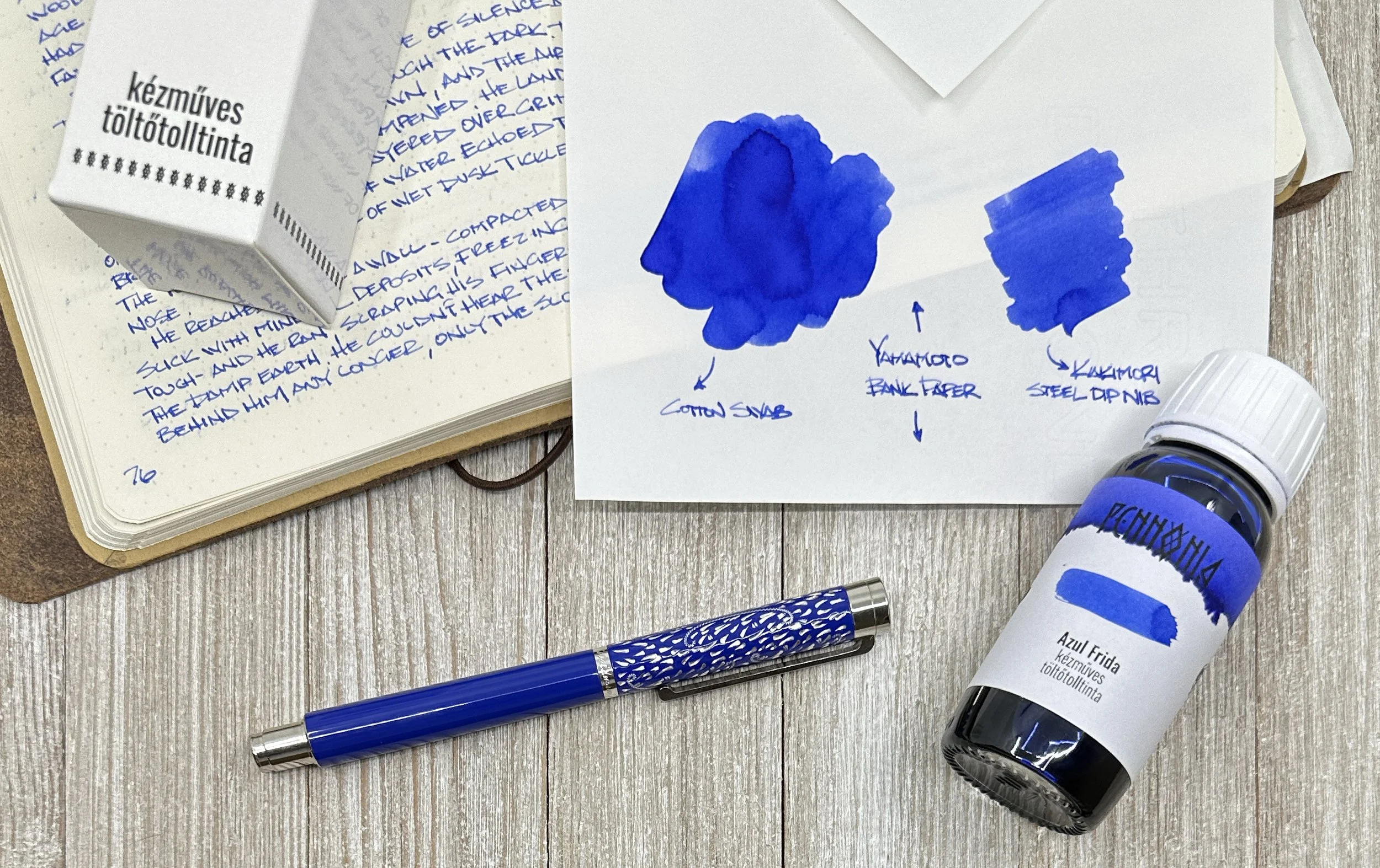
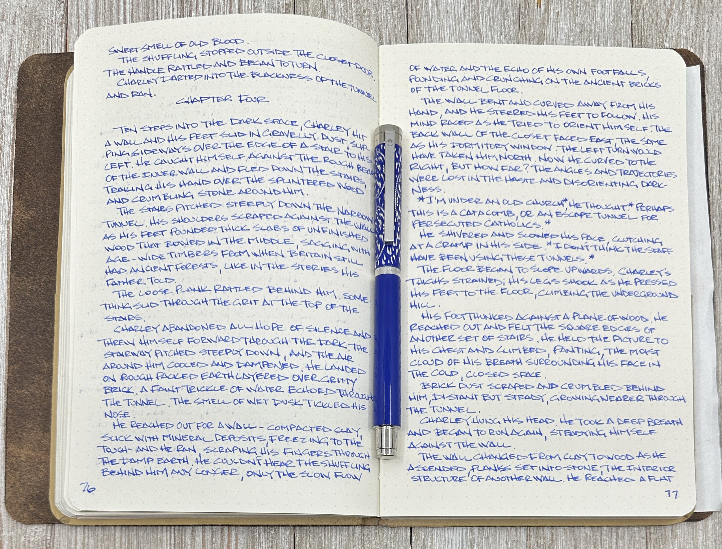
As usual, all swatches were done on Col-O-Ring cards and also Wearingeul Instant Film Color Swatch cards, using a Kakimori steel dip nib and writing samples were done primarily with a Lamy Vista with a steel Medium nib and a TWSBI Go with a Medium nib. The notebooks used for writing samples are from an Endless Recorder and Odyssey Notebooks, both with 68 gsm Tomoe River paper. Dry times for the Vista are shown with “(V)” and the Go will be shown below that with a “(T)”. Dry times may be a bit slower on 52gsm TR or faster on more absorbent papers like Rhodia, copy paper, Cosmo Air Light, or with drier or finer nibs.
Side note: Photographing inks is not easy. My photo editing skills are mediocre at best, so I prioritize swatch/writing sample accuracy over paper or background color accuracy. Even then, it doesn’t always work out – it could look great in the Lightroom app, and then less great when I export to my phone, or great on phone, and less great when I upload to the Bossman’s Dropbox, etc.
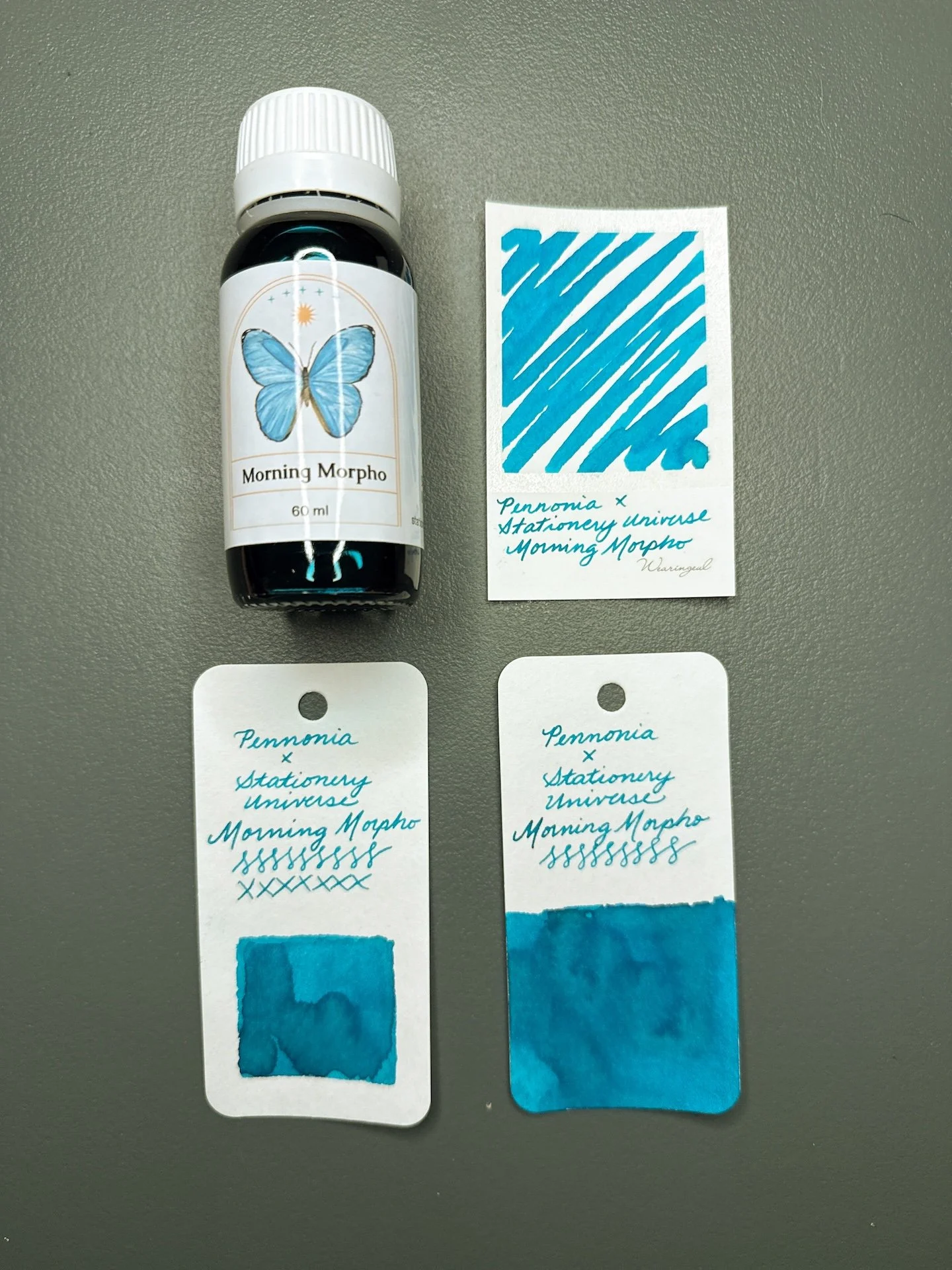
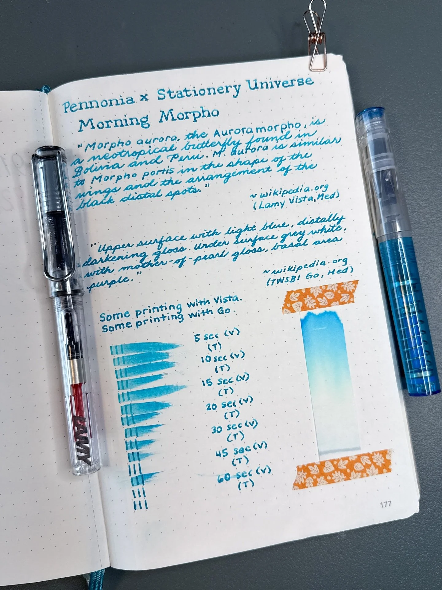
Morning Morpho and swatches.
Morning Morpho is a turquoise-leaning teal that looks more turquoise in drier pens and a bit more green (but still very much a blue teal) in wetter pens. In the TWSBI Go, the line is more saturated while the drier Vista shows off a bit of the shading. There was no sheen from either pen. It had average to fast dry times in both pens.
Morning Morpho writing sample.
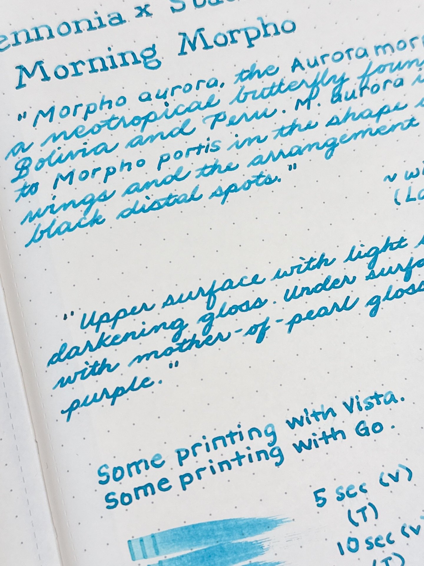
You can see the Morning Morpho’s shading, as well as its more turquoise color, from the Vista (top) versus a more saturated writing sample from the Go.
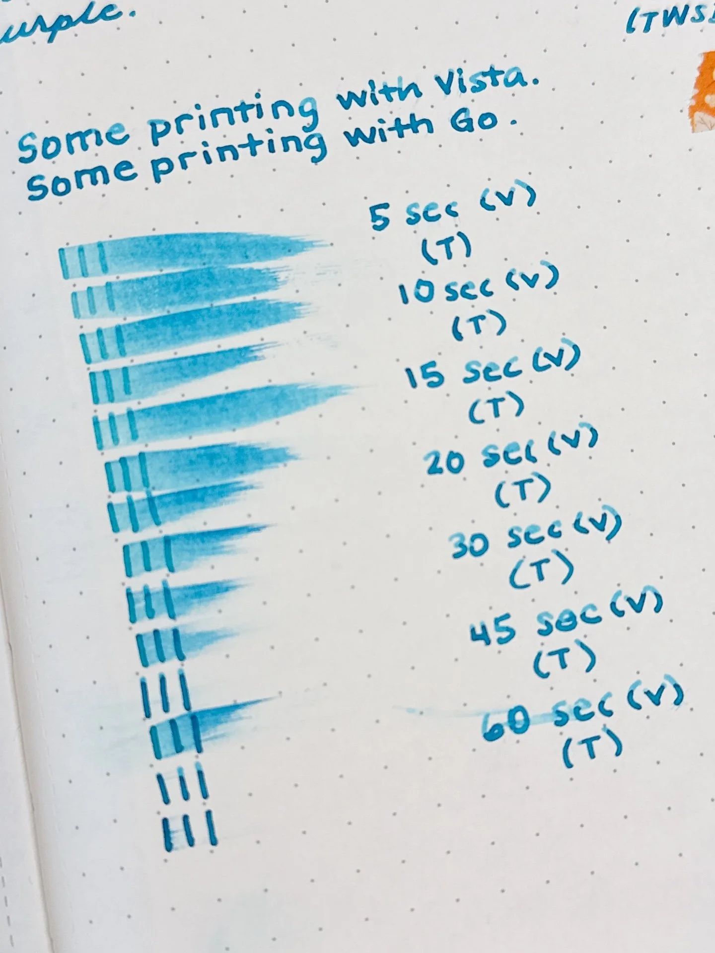
Average dry time for Morning Morpho. Not surprising that the wetter Go’s writing sample took longer to dry.
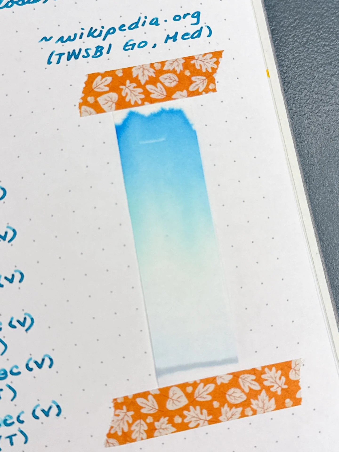
Chromatography from Morning Morpho - A straight forward turquoise chromatography with a touch of light yellow in the middle.
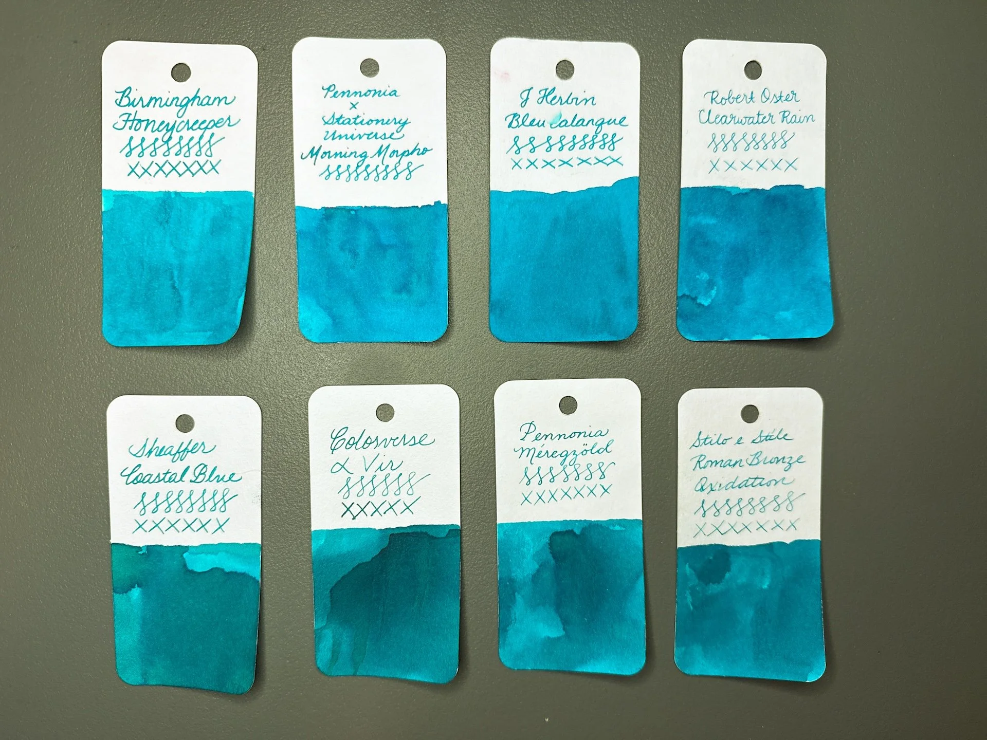
Inks similar to Morning Morpho: Birmingham Honeycreeper (a bit too too blue, too bright), J Herbin Bleu Calanque and Robert Oster Clearwater Rain are probably the closest, but needs a touch more green), Sheaffer Coastal Blue, Colorverse a Vir, Pennonia Meregzold, and Stilo e Stile Roman Bronze Oxidation lean too green (but are closer when viewed irl).
Morning Morpho Shimmering and swatches.
Guess which one has Morning Morpho Shimmering? (hint, it’s the one on the left.)
Morning Morpho Shimmering has the same base ink as the above Morning Morpho, but with the addition of pearlescent turquoise shimmer particles. Lamy Safari-based pens, like the Vista, can be a bit ink-stingy with their nib/feeds (one of the reasons why they tend to lean drier compared to other pens) - this has the added effect of making shimmers less obvious in the Vista writing sample. Friction-fit TWSBIs like the Go, Eco, Swipe, have a more generous flow, resulting in more shimmer flowing onto the paper. The turquoise shimmer also makes the ink look lighter in some angles.
Morning Morpho Shimmering writing sample.
Morning Morpho Shimmering doesn’t shimmer much from the Vista (top) but is definitely there from the wetter Go.
Shimmer PSA: As with any shimmer in any pen, periodically “rotate” the pen nib up and down, so the shimmer particles have a chance to disperse. If your feed looks saturated with shimmer, or seems to be clogging the feed, you can try to gently flood the feed with ink (either by gently twisting the converter or piston, or lightly pressing the spring or button) and then retracting the converter/piston/spring/button to “suck up” the shimmer particles back into the converter/barrel. Always do this over a sink or paper towel, not over your precious writing or art 🙂
While the shimmer version didn’t have significantly different dry times, I was a little surprised that both pens’ writing samples didn’t smear as much when wet (nevermind my wet finger smudge on the bottom, that was me, not the ink or paper).
Chromatography from Morning Morpho Shimmering - Same chromatography as above - turquoise/teal with some yellow in the middle. Shimmer particles are too heavy to travel up the strip so there isn’t anything sparkly to see.
Inks similar to Morning Morpho Shimmering are the same as above, but I swapped out Birmingham Honeycreeper with Jacques Herbin Turquoise de Perse since it is a shimmer ink. That is also a wee bit more turquoise than Morning Morpho, but is pretty close.
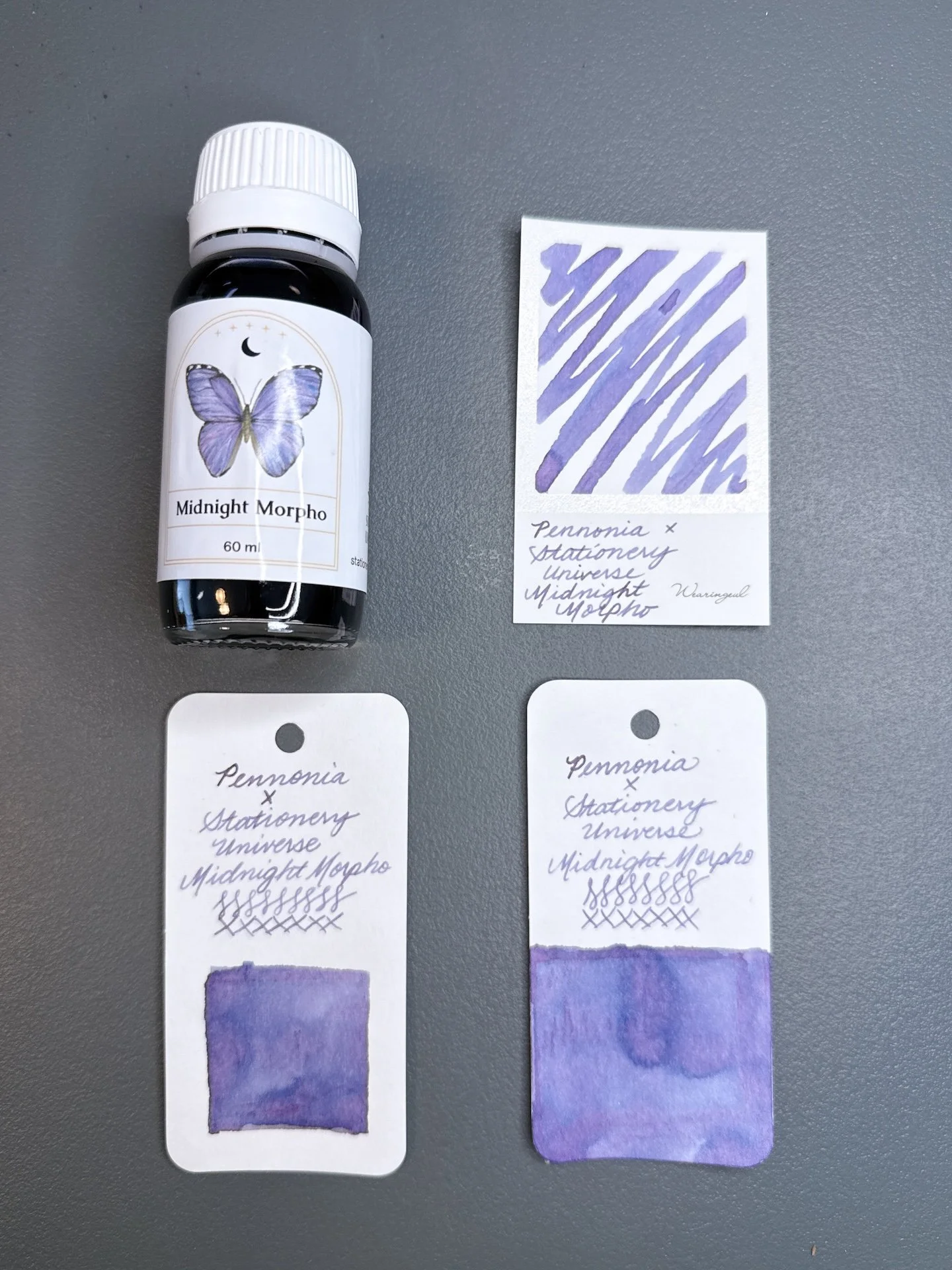
Midnight Morpho and swatches.
Midnight Morpho is a chroma shading dusty purple ink. In swatches, you can see shades of blues and even pinks, especially when more ink is laid down. Compared to Morning Morpho, Midnight Morpho is a bit drier, which is common amongst chroma-shading inks. I wouldn’t say that it was too dry in the Lamy Vista, but it flowed better from the TWSBI Go. There was no sheen from either pen, and dried slightly faster than Morning Morpho (average to fast dry times).
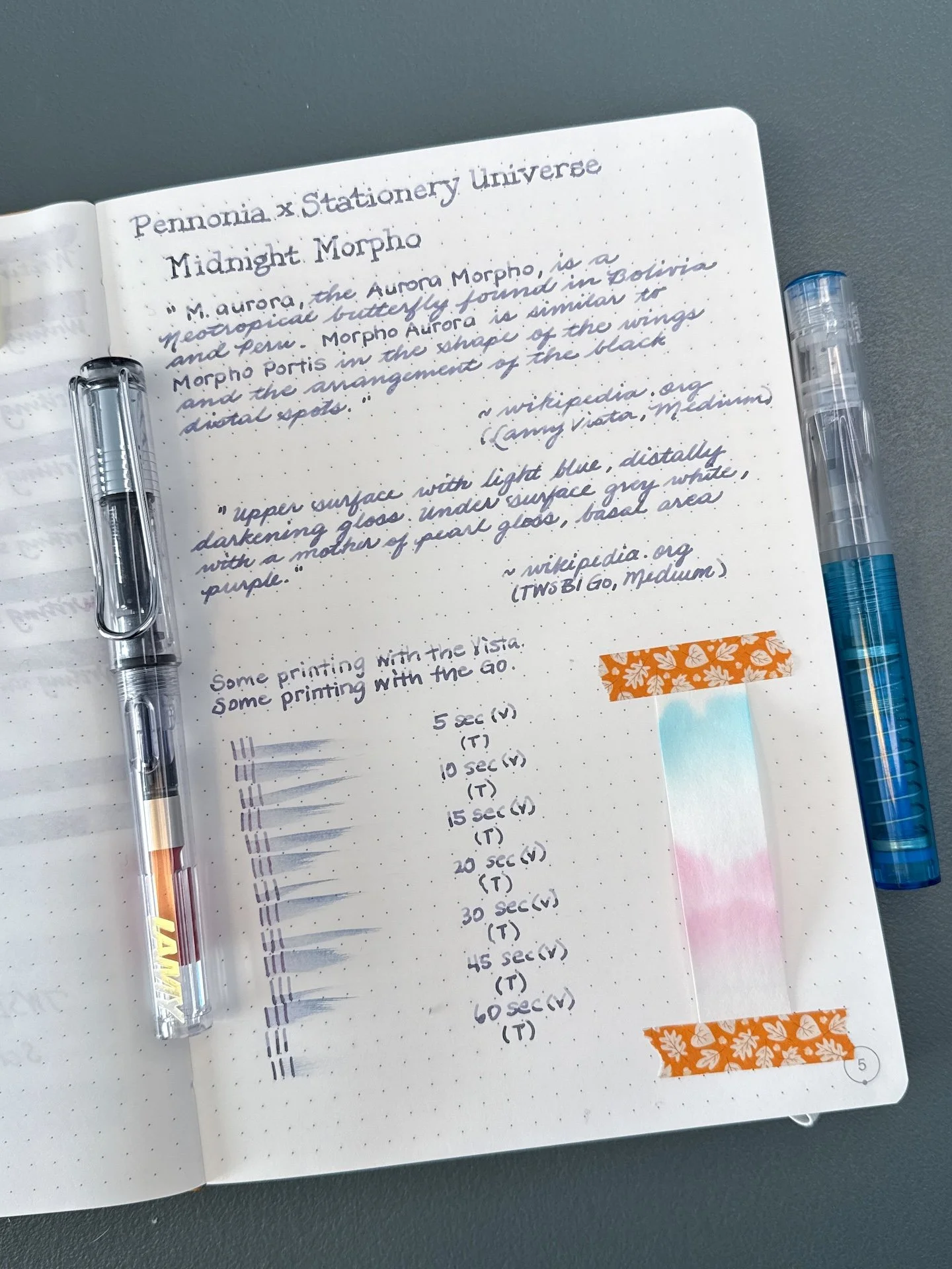
Midnight Morpho writing sample.
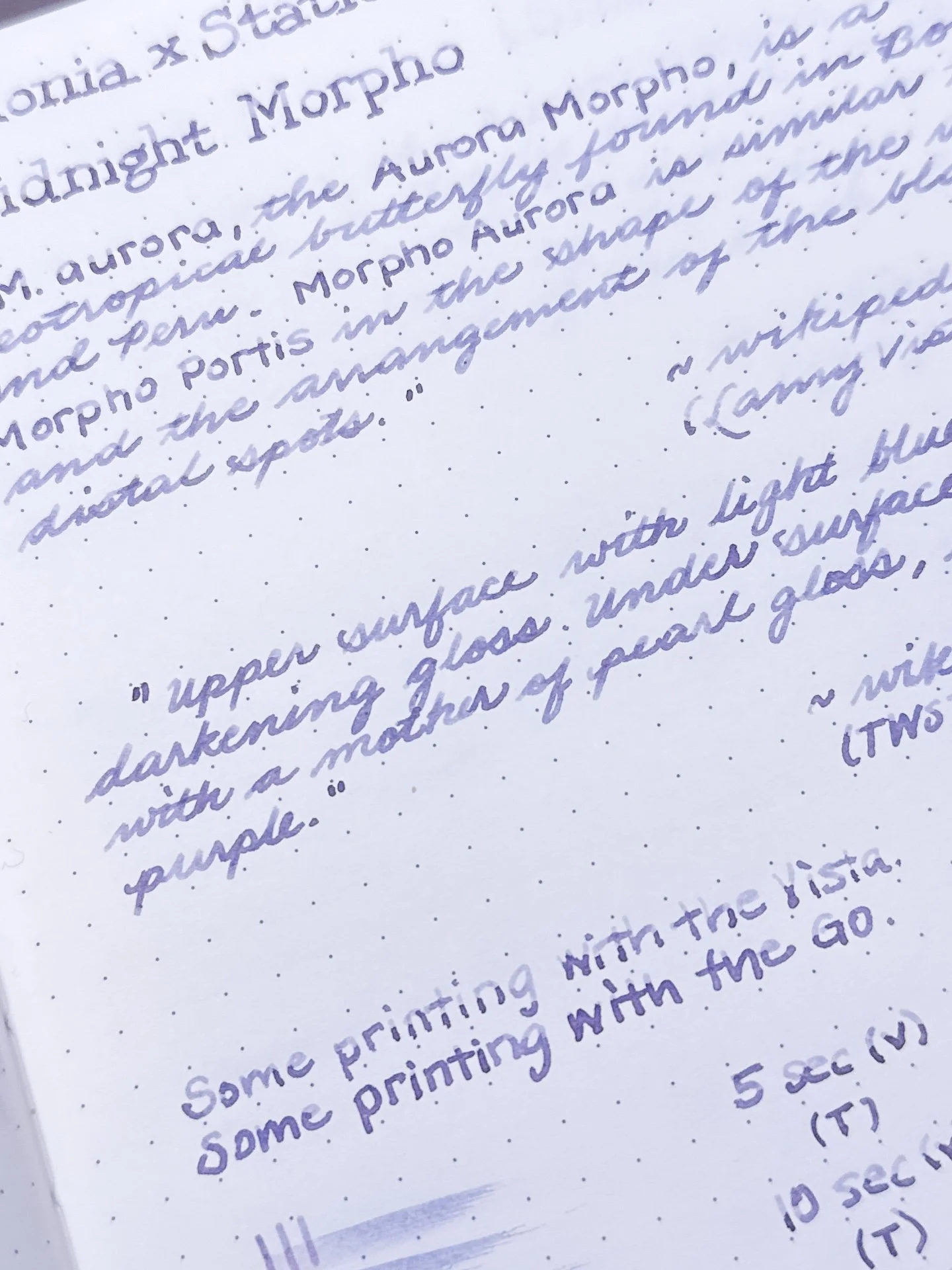
You can really see Midnight Morpho’s shading from the drier Vista (top) but the slightly wetter line from the Go still shows some dual shading as well.
Midnight Morpho has a decent dry time.
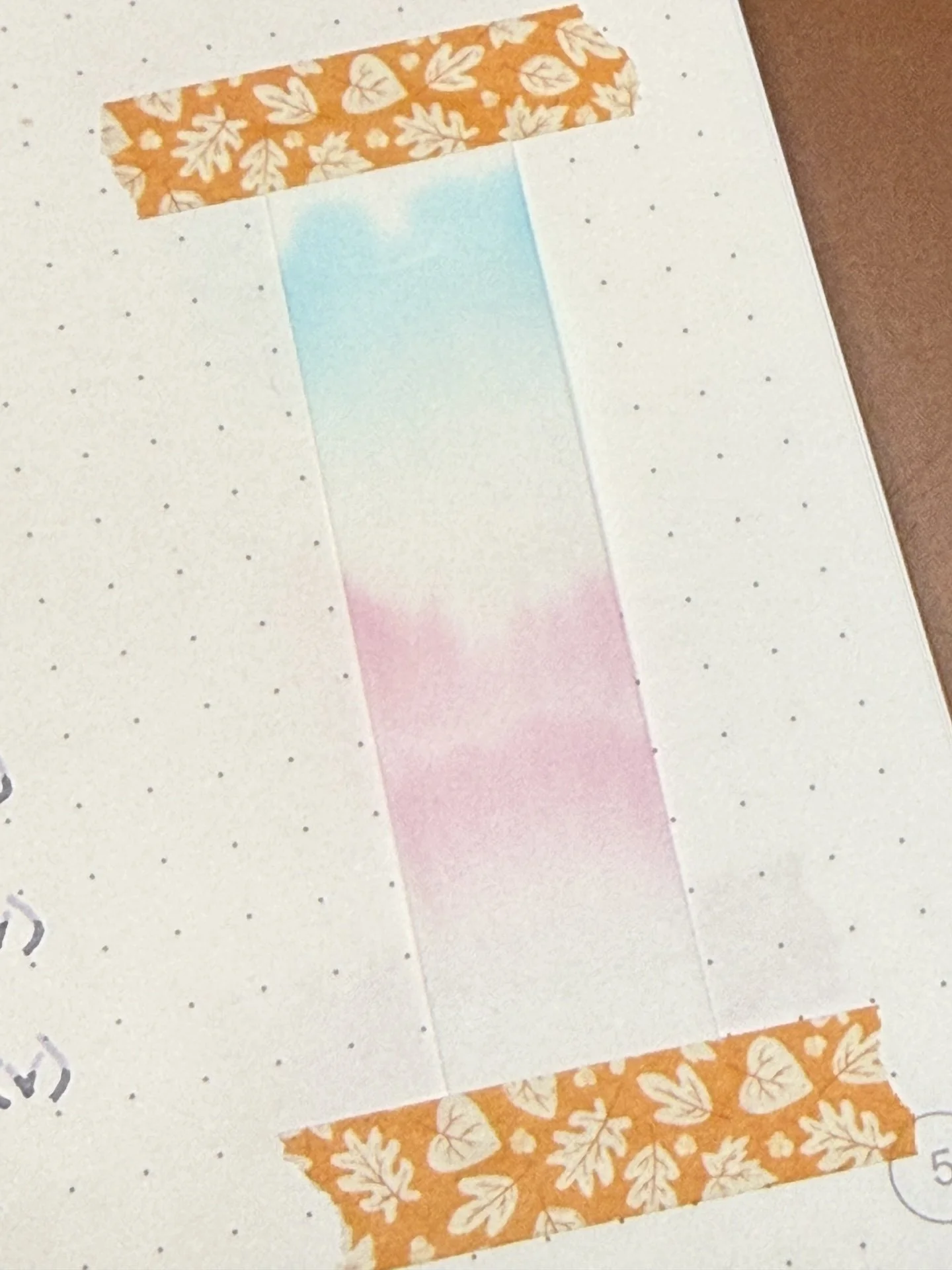
Chromatography from Midnight Morpho starts with pink before separating from the turquoise.
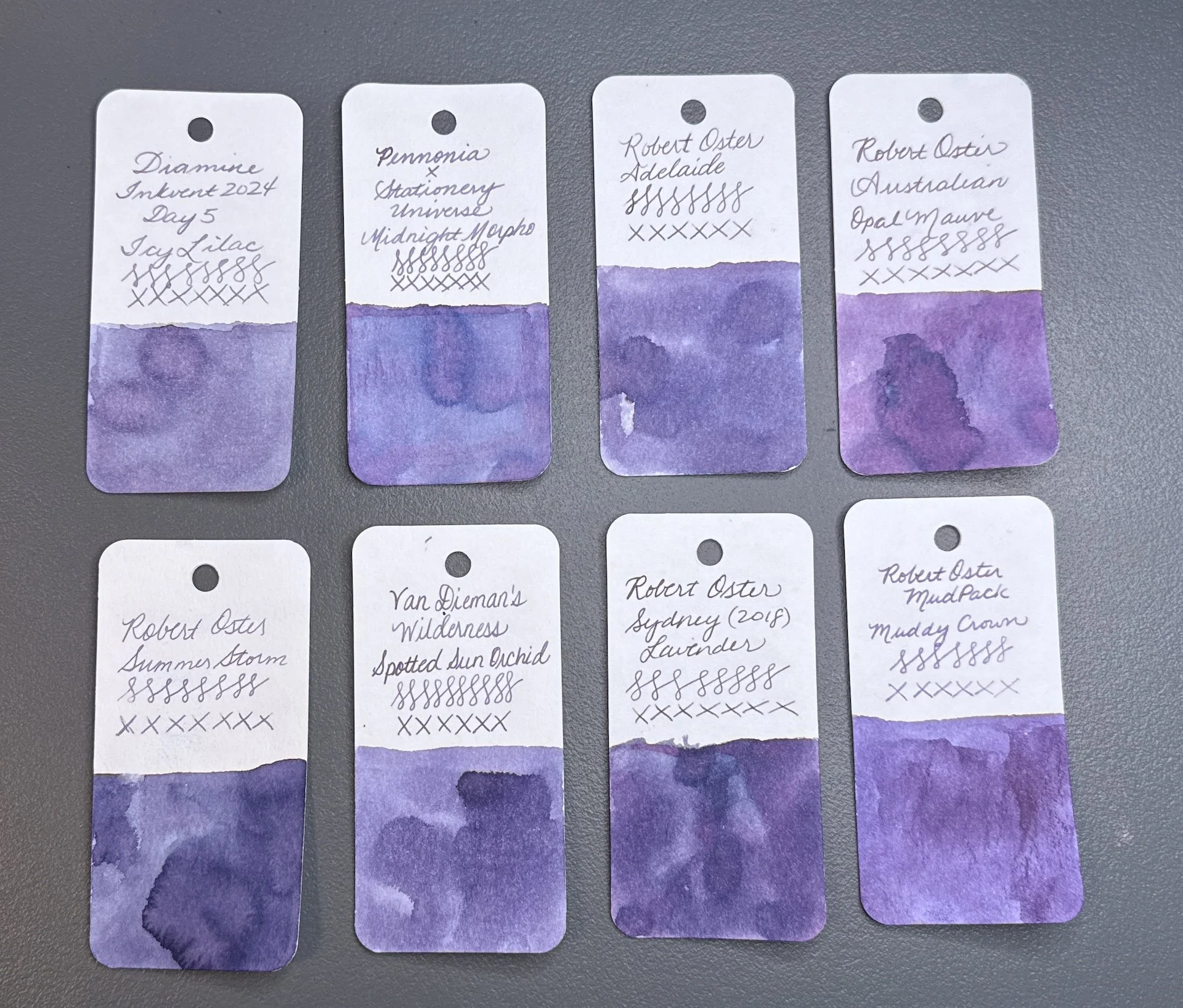
Inks similar to Midnight Morpho: Diamine Icy Lilac (from Inkvent 2024), Robert Oster Adelaide, Robert Oster Australian Opal Mauve (too red), Robert Oster Summer Storm, Van Dieman’s Spotted Sun Orchid, Robert Oster Sydney Lavender, Robert Oster Muddy Crown. Most of these didn’t have the touch of blue that Midnight Morpho has - Icy Lilac is probably the closest.
Midnight Morpho Shimmering and swatches.
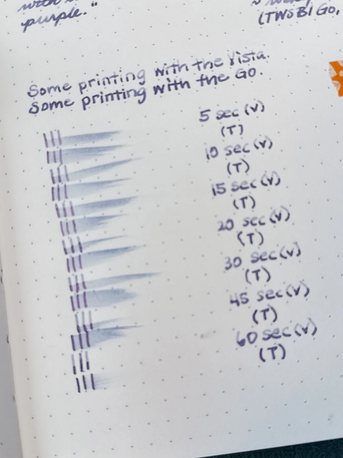
Midnight Morpho has plenty of shimmer in the bottle but it’s harder to see in writing and swatches.
Midnight Morpho Shimmering has the same base ink as its non-shimmering sibling, but this one has a purple pearlescent shimmer! The purple shimmer almost disappears against the purple ink.
Midnight Morpho Shimmering writing sample.
Midnight Morpho Shimmering’s shading is more dramatic from the Vista (top) but there is still some shading with the wetter Go.
Virtually impossible to tell from pictures, but there is shimmer in both of those writing samples, particularly the bottom half of the word “printing” on the top line and “with” on the bottom line.
Dry times for the Midnight Morpho Shimmering.
Chromatography from Midnight Morpho Shimmering - Same chromatography as above - starting with pink on the bottom and then a small break before more pink, then a bigger gap before you get to the turquoise/teal on top. Shimmer particles are too heavy to travel up the strip but you can see a little bit of shimmer at the very bottom.
Inks similar to Midnight Morpho Shimmering are the same as above. I don’t have any inks similar in color that had shimmer, besides Diamine Icy Lilac.
All of the inks behaved well, and cleaned out easily. I like seeing how different pens can produce similar but different results with the same ink.
Of the four inks, I think I’d pick Midnight Morpho because it is such a beautiful ink - hard to say if I’d pick it with or without shimmer. You definitely want a wetter writer if you want to see more of the shimmer.
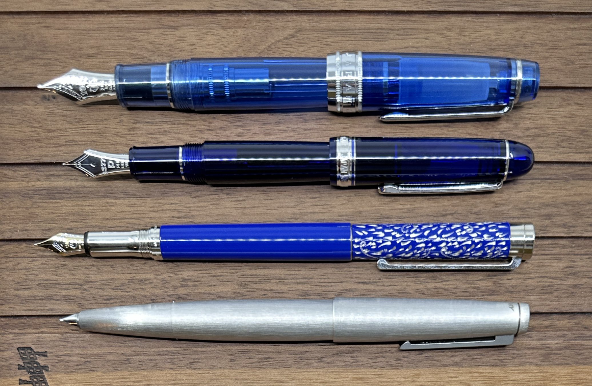
Some pens I’d match with these inks (clockwise from upper left): Pilot x Bungubox Custom 823 Fujiyama Blue; TWSBI 580 ALR Purple, Lamy AL-Star Pacific Blue; Aurora Optima Lila.
The 60 ml ink bottles of the Stationery Universe Morpho Collection cost $20/bottle for non-shimmer and $22 with shimmer.
(Disclaimer: Thank you to Tori Woods of Stationery Universe for providing these inks for review. All other inks are my own.)