Posts filed under Ink Reviews

Kyo-no-oto No. 6 Adzuki-iro Ink: A Review

(Susan M. Pigott is a fountain pen collector, pen and paperholic, photographer, and professor. You can find more from Susan on her blog Scribalishess.)

Several weeks ago, Vanness sent the Pen Addict ink samples for review. One of the inks I received was Kyo-no-oto No. 6 Adzuki-iro, a burgundy ink that I loaded into my TWSBI Eco T to test the pen. I loved the ink so much that I purchased a bottle.

Adzuki-iro means “red beans.” It is a limited edition ink from the TAG Stationery Store in Kyoto, Japan. “Adzuki-iro” sounds more beautiful to my ear than “red beans,” and this color certainly lacks any brown tones that I would associate with red beans. The color is a gorgeous cabernet that reminds me of the deeper hues of cherry blossoms.

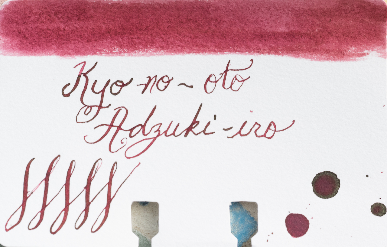
In my ink test, you can see how Adzuki-iro performs on Maruman Septcouleur paper. It has lots of saturation, especially when you layer it, and it dries fairly quickly. It is not water resistant.

I was fascinated by the chromatography test. The ink contains a wide array of colors: light blue, lavender, pink, red, and orange.

This complexity gives the ink much more depth and character than two similar inks, Kyo-Iro No. 5 Keage-Sakura and Robert Oster Cherry Blossom.

Although Adzuki-iro isn’t a super sheeny ink, it does exhibit a bit of green sheen when it pools.

The ink performs quite well in my TWSBI stub (I’ve been using it for several weeks), though the shading characteristics are much more noticeable in wider nibs.

I really love this ink. It is not as flashy as Iroshizuku Yama-Budo, which makes it much more versatile--it is dark enough in finer nibs that you could definitely use it at work and for correspondence. In wider nibs, its lovely burgundy-pink tones and shading make it a great choice for cards, art, and calligraphy.

You can purchase a 40ml bottle of Adzuki-iro from Vanness Pens for $28.00. You might want to hurry, though. Since this is a limited edition color that I am crazy about, I may wind up purchasing whatever Vanness has left in stock!

(Vanness Pens provided this product at no charge to The Pen Addict for review purposes.)


Enjoy reading The Pen Addict? Then consider becoming a member to receive additional weekly content, giveaways, and discounts in The Pen Addict shop. Plus, you support me and the site directly, for which I am very grateful.

Membership starts at just $5/month, with a discounted annual option available. To find out more about membership click here and join us!

Posted on February 15, 2019 and filed under Kyo-no-oto, Ink Reviews.

Diamine Starlit Sea Shimmering Ink Review

Well, it looks like shimmer ink happened to me. And I have Diamine Starlit Sea to thank for that.

I didn’t think it would happen in all honesty. While I always appreciated the look of a good shimmer ink, I had no desire to use one for more than a test run, much less keep it in the rotation. I was scared of them, rightfully or wrongfully. If you don’t have good fountain pen hygiene and maintenance, any fountain pen ink can cause problems in your pen. Why would anyone in their right mind risk adding sparkles into what is often a finely-tuned writing machine?

Because they are awesome.

I began seeing swatches of Diamine Shimmer inks in 2015, and like other popular shimmer inks - J. Herbin for example - I loved how they looked. Still, I had zero desire to use them. But as the lineup expanded, and the color selection exploded, I could no longer contain myself.

Starlit Sea had two things going for it when I chose to use it: An interesting base color, and silver sparkles. The second part is almost mandatory for me personally. Just like with fountain pen hardware, gold is a much higher bar to clear and has do be done just right for me to choose it. Silver sparkles and rhodium trim are my jam.

The first part, the underlying blue black ink color, was kind of a chicken move on my part. I could have gone more experimental, like with Neon Lime or Citrus Ice, but I played it safe this time around. It was the right call too, because this shade is more than interesting enough. There is a bright, turquoise-like tone under the dark blue when the ink first goes down and prior to the sparkle taking over. It’s really fun to watch go down on the page, and the color does peek out from time to time in the finished product.

And that finished product is full of sparkles! Like, a lot of sparkles. I think by coming in at this juncture of the shimmer ink product cycle I’m getting the best version of this style of ink. The particles are super-fine, don’t clog any part of the pen, and have a very high dispersal rate throughout the ink on the page. The more I think about it, the more impressed I become.

So count me in. I’m on the sparkle ink bandwagon. Better late than never, right? I see a future where I have at least one shimmering ink inked up at all times, just for the fun and fascination it provides on the page. And isn’t that what it’s all about?

(JetPens provided this product at no charge to The Pen Addict for review purposes.)


Enjoy reading The Pen Addict? Then consider becoming a member to receive additional weekly content, giveaways, and discounts in The Pen Addict shop. Plus, you support me and the site directly, for which I am very grateful.

Membership starts at just $5/month, with a discounted annual option available. To find out more about membership click here and join us!

Posted on February 4, 2019 and filed under Diamine, Shimmer Ink, Ink Reviews.

Colorverse Extra Dimension & Warped Passages Ink Review

(Jeff Abbott is a regular contributor at The Pen Addict. You can find more from Jeff online at Draft Evolution and Twitter.)

It seems like it's only been a couple of years since the Colorverse ink brand exploded onto the stationery scene, along with their break-neck pace for releasing gorgeous space-themed inks. I've always wanted to collect all the various ink colors they sell for all the reasons Colorverse make them: They're beautiful colors and they are all based on real scientific concepts and space exploration. It's a dream come true.

Alas, there are far too many inks in the line to purchase them all. But one of the latest batches I've tried out is the Extra Dimension & Warped Passages set. This set contains a large bottle (65 ml) of Extra Dimension and a small bottle (15 ml) of Warped Passages. These colors are both beautiful blues at different ends of the spectrum. Extra Dimension is a dark, almost black, blue, while Warped Passages is a light, dusty denim. The multiverse series are based on concepts of harmony and symmetry, so it only makes sense that these two colors compliment each other so well.

Before going into the behavior and individual characteristics of these inks, I'll start by saying that they both behave very well. The flow is just right, I haven't had any issues with nibs drying out or flow problems after a while of non-use. Cleaning out pens is easy, and I haven't noticed any adverse effects. Like Colorverse claim, these inks are gentle on your pens, and I can attest to that fact.

Starting with Extra Dimension, there are depths to this color that unfold with the right nib. It's largely a blue-black ink with a fair amount of shading, but you can also detect some red sheen in certain light if you put down enough ink. I absolutely love red sheen in blue inks, and the subtle change in color is splendid after the ink dries.

Along with the blue-black qualities, you can also pick out some green/teal if the ink is spread out enough. Personally, I wish more of this hue was visible under normal writing conditions. You can really only see it clearly when swapping lots of ink. Perhaps with the right nib, this color would shine.

Dry time is a bit lengthy with this ink, but it isn't excessive. Somewhere between 18 and 24 seconds seems to be the magic time. Don't let the dry time deter you from picking up this ink unless that's a hard requirement for you.

Warped Passages is a color that made me unsure for the first few minutes of use. It's pale, dusty, and unassuming. But when you really look at the depth of the color and (especially) compare it alongside Extra Dimension, this color takes on a whole new quality. Under normal writing circumstances, this feels like a medium blue with great shading qualities. In the bits of shade, you can pick out hints of green, just like the Extra Dimension ink. These hints of green in both inks really delight me, and I'm not sure I'll ever use one of these inks without the other. They beg to be used together.

While this dusty blue is lighter than its larger sibling, it's still a medium blue that suits office environments well. It shades nicely, giving it a lot of visual interest on the page. I see this ink easily becoming one of my favorites. It's just a shame the bottle is so small!

These, again, are two different inks. Extra Dimension is the larger of the two, coming in at 65 ml. Warped Passages is only 15 ml, which is similar to a few sample vials. Unfortunately, you can't purchase these inks individually. They're meant to be a complimentary set, and I can't agree more. I just wish the two bottles were the same size!

(JetPens provided this product at no charge to The Pen Addict for review purposes.)


Enjoy reading The Pen Addict? Then consider becoming a member to receive additional weekly content, giveaways, and discounts in The Pen Addict shop. Plus, you support me and the site directly, for which I am very grateful.

Membership starts at just $5/month, with a discounted annual option available. To find out more about membership click here and join us!

Posted on January 30, 2019 and filed under Colorverse, Ink Reviews.